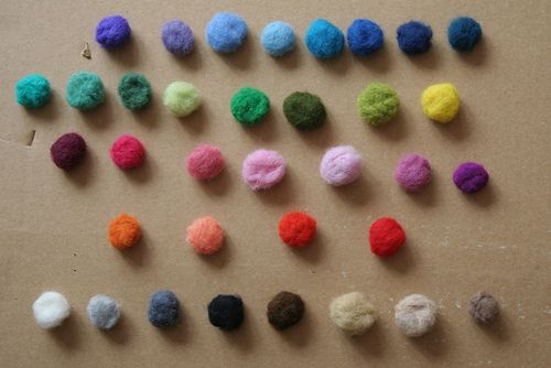
Continuing our series during this final year of AoS of the top 12 published posts of all time (measured in simple traffic numbers), this one from the website’s early years is still number three. I admit this surprises me!
xoxo, Tsh
The Countdown: 12 / 11 / 10 / 9 / 8 / 7 / 6 / 5 / 4 / 3 / 2 / 1
Modern research shows that when our eyes connect with a color, our brains release different chemicals that impact us physically and emotionally.
Being in a red room will increase our heart rate and stimulate chemicals associated with aggression and high energy, while the color yellow stimulates serotonin (the feel-good chemical) in our brains.
Color therapy has been practiced in traditional healing professions for many years, but marketers and businesses also use color to shift human moods.
It is no coincidence that many fast food restaurants use red liberally, or that Volkswagen uses yellow to induce a happy-go-lucky image. We see greens and blues in yoga studios, and some prisons house aggressive inmates in pink rooms for its calming and energy draining effects.
As we learn the attributes of each color, we too can use this knowledge to create atmospheres in different rooms of our homes. Here are some ideas.
Color Qualities

Red
Red is associated with high energy and power. It’s the color our eyes are drawn to first, so a little can go a long way. Red signals courage, ambition, and strength. It promotes alertness and speed and connects us to our physical selves.
Red may help instill confidence, get us going when we need to be active or task-oriented, and can help as an appetite stimulant.
When there is too much red present, or if someone is sensitive to reds, they may experience feelings of irritation, anger or hostility. Red is often best suited as an accent color instead of the primary color in decor.
Orange
Orange is a warm, inviting, and joyful color. It invokes feelings of sociability, enjoyable connection, and happiness. It has an emotionally-strong presence and promotes extroverted behavior, making it a fantastic color for gathering spaces to promote interaction and relationship building.
Because orange contains red, it too can be overused. Too much orange (or an orange that is too bright or intense) can create overwhelm, irritation, or frustration.
Yellow
Yellow is the color of optimism, brightness, cheery attitude, and mental clarity. It promotes creative, clear, upbeat thinking and decision making. Yellow can be helpful in easing depression and encouraging laughter.
Studies have shown that over-exposure to yellow, especially intense and deep yellows, can increase irritability, crying, hyperactivity, and can shorten tempers in babies and children (as well as adults).
Green
Green promotes renewal, balance, refreshment, and peace, which creates a calming influence and reduced stress. Indoor houseplants and herb gardens are an excellent way to bring green into homes.
While there’s not much of a negative side to too much green, it can promote laziness and lack of initiative if overused.
Blue
Blue promotes rest and calm and is a popular color (most people claim their favorite color is blue). Blue can be effective in warding off insomnia and promoting deep sleep. It can help balance hyperactivity in children and promotes imagination and intuitive thinking.
While blue can often be tolerated in higher amounts than other colors, it is a cool color, and too much blue can shift into feelings of apathy, pessimism, or separation from others. Balancing blues with a warmer, more relational color is smart for gathering spaces in a home.
Violet
Violet is often a favorite color among adolescent girls, and it stimulates the problem-solving areas in our brain, and it promotes creativity, intuition, and artistic ability. In design, violet communicates richness and sophistication.
Overuse of violet may result in feelings of insecurity or emotion suppression.
Your Personal Color Chart

Before bringing color into your home, do a little personal assessment of how color impacts you. Sometimes a color may generally impact people one way, but for you it brings out entirely different moods, feelings, or emotions.
Write out each color on a sheet of paper (perhaps use a set of crayons or colored pencils to shade in a space of color on the page) and write down any words that come to mind. Don’t analyze it, just let it come out, stream of consciousness.
After jotting down your knee-jerk feelings about each color, review it and see if you feel drawn to certain colors — or perhaps resistant to others. Use this as a guide as you think about ways to bring color into your world.
How do others in your family respond to color? Have your spouse and older children do this exercise; it might remind you how unique (and similar) they are and how to be sensitive to everyone in your household.
Put It To Work
There are countless ways to weave color intentionally into your surroundings, from completely redoing a room’s decor to adding subtle but effective accent colors to a space. Conduct your own “case studies” and put color to work in your home. A few examples are below.
1. Eating Spaces
Room: Dining room
Who uses the space: The whole family, all throughout the day.
Desired effect: I’d like this space to promote conversation, feel enjoyable and relaxed (but not overly serene), and encourage appetite and family connection.
Current elements in the room: In our home, the dining room is painted a light butter yellow, with the lower half and the walls a white wainscoting. Large windows open to our backyard with lots of trees in view. Some casual family photos hang on the largest wall.
Ideas: I like the yellow for the warmth and upbeat feel. I may want to accentuate nature’s colors from the backyard view with green or brown window treatments (invigorating and grounding colors). Adding deep orange accents would add warmth, encourage conversation, and stimulate appetites. Wall decor, chair upholstery, candles on decorative shelves, fresh flowers, placemats, napkins, vases with colored water, and a centerpiece are all areas for color.
2. Work/Study Area
Room: Office
Who uses the space: Since my children are still too young to use a formal study area, my husband and I primarily share this space.
Desired effect: I often need to be stimulated when I work (lest I doze off for a nap). It would be nice to have a space that energized me, drew out creative thought, and kept my mind alert.
Current elements in the room: This room is sparse with hardwood floors and no area rug, and with light blue/green paint.
Ideas: Greens are fantastic for adding refreshment and for keeping my mind focused and relaxed. I’d like to see layers of greens as the main color scheme and punctuate the room with accents of violet. Too much purple can feel overwhelming for me, but small pops of rich, saturated violet color draw out creative thought and balance an overly-analytical mind. Perhaps a vase with a bunch of dried lavender stems, a fabric runner for my desk, an area rug, or covering some books on the shelf in a violet paper.


